Olenka Hamilton heads to London Design Week and finds that minimalism has been traded for abundance in the tastes of HNWs
Sometimes a major shift in style can be crystallised by an overheard remark. At a press lunch at the Design Centre in Chelsea Harbour, Spear’s heard an industry insider saying: ‘I don’t know why Kelly [Hoppen] keeps doing it.’ The response came in a world-weary drawl: ‘Yes, all that beige. Hertford Street is so much more in right now.’
Like this, the world changes – by whispered consensus. And in fact, London Design Week appears to bear out that assessment. Muted colours and quiet minimalism are out; abundance is in.
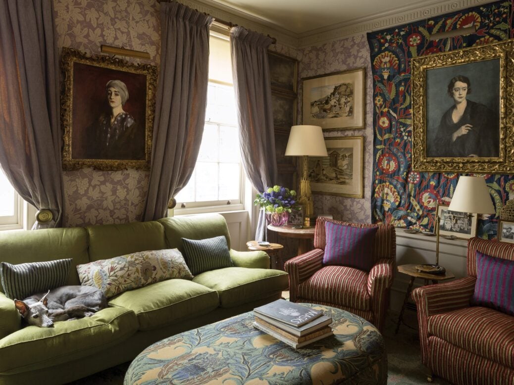
First, for those who haven’t been, the interior at 5 Hertford Street is as far from Hoppen-esque as one can get – it’s a glorious mishmash of patterns, prints and a wide-ranging selection of art, decorative chandeliers and open fireplaces. It should be too much – but it’s so tasteful that it isn’t.
Rumour has it that members wander around in velvet slippers. One sincerely hopes that that’s true: nothing could be more appropriate in a club seeking to resemble a lavish country house. It’s no surprise then that the taste is spreading: people want to bring Hertford into their own homes – at least that’s the immediate impression at the Design Centre on the opening day of London Design week.
Becky Metcalfe, the design centre’s PR manager, says open plan spaces and minimalist interiors are relics of the past. In her view, people now want intricate craftsmanship, tactile materials and imaginative colour combinations which create warm, uplifting and cosy spaces. And they’re willing to put in the hours: Metcalfe calls it ‘couture for the home’.
One example of the trend is the exhibit by Savoir Beds. Well-known for their innovative collaborations with designers, they have now teamed up with the National Gallery in a scheme which allows every painting on the gallery premises to be upholstered onto a Savoir headboard and base – so you’ll now fall asleep under Monet’s waterlilies, Mr and Mrs Andrews, or The Fighting Temeraire.
It doesn’t end there. Whether it’s bright floral wallpaper and block colour furniture at Nina Campbell, an Arden fabric by Zoffany or a beautiful textured lamp from Porta Romana – at the Design Centre this week, the times they are a-changing. Today’s interiors are busy, colourful, bold and classic. The historic silks and damasks of Watts of Westminster, for example, are very much back at the forefront of the country house aesthetic.
These shifts make one curious as to how 5 Hertford Street came about. ‘The original brief was to do something timeless,’ recalls 5 Hertford Street designer Rifat Ozbek, a Central St Martins graduate from Turkey, who was one of the most celebrated fashion designers of the 1980s. Ozbek had, in fact, been dressing Hertford Street’s owner Robin Birley’s wife for two decades before taking on his great interiors project at the private members’ club.
It all makes one appreciate his achievement the more. There’s ‘a love tunnel’ in classic silk damask paisley patterns, which takes members from the dance floor to the lobby. There are also Venetian, Bakst, Ottoman-themed dining rooms with mirrored gothic Moorish arches. ‘You can now see the changing colours of every room from one place,’ explains Ozbek.
And if you had to describe this new look in an object it would be a mirrored glass arch hand-painted in faux tortoiseshell, all backlit with LEDs and shining pink. It’s the pinnacle of couture for the home – and frankly, if Kelly Hoppen is on the way out, then there’s there are abundant consolations to be had about the place we’re moving towards.
Olenka Hamilton is staff writer at Spear’s
Related articles
£50m Picasso shrugs off Brexit blues

