The new V&A exhibition space shows a museum readying itself for the future, writes Rebecca Morton
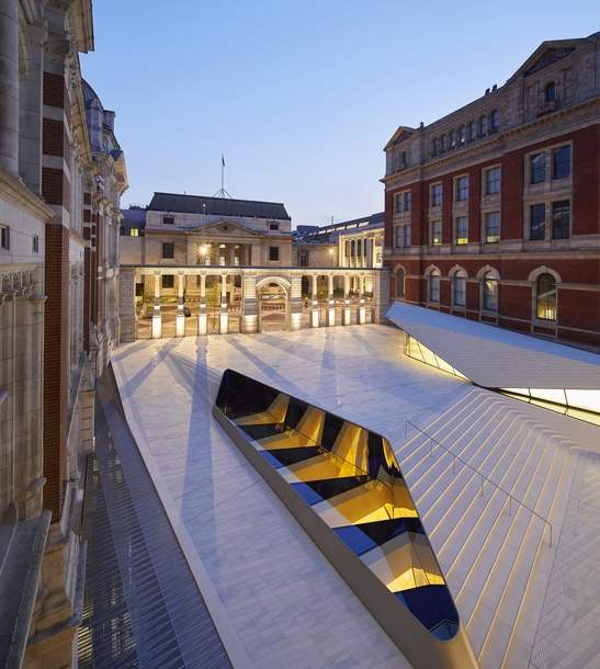
The Sackler Courtyard, the entryway to the new Exhibition Road Quarter at the Victoria and Albert Museum, is somewhere between moonscape and creatively tiled bathroom. Combining bright, white tiling with sharp contouring and the sleek, steel balustrade of the Oculus Skylight, which doubles as a futuristic centrepiece and a window into the gallery below, it is equal parts Mediterranean and space-age, no parts central London.
This cold, white landscape is just the tip of the iceberg. The new development, which cost £54.5 million and has been twenty years in the making, also includes a new entrance hall – the Blavatnik Hall – and the cavernous Sainsbury Gallery, a subterranean exhibition space of 1,100 square metres (about five and a half tennis courts).
Although sceptics might be inclined to dismiss the renovation as the mother of all iceberg basements, more generous visitors will likely be reminded of the 1989 redesign of the Louvre, with its juxtaposition of Renaissance and contemporary architecture and spacious, underground entrance hall.
The V&A’s largest building project for over a hundred years, the redevelopment is, like the Louvre, a fusion of old and new. Fronted by the Aston Webb Screen, which was built in 1909 and once concealed the museum’s boiler houses, the building of the ultramodern, subterranean Sainsbury Gallery involved the excavation of earth and clay dating back as far as 50 million years. Director, Tristram Hunt, says that ‘with its mix of ingenuity and imagination, the V&A has always been a meeting point for historicism and modernity. The V&A Exhibition Road Quarter bridges the two by offering fresh insights into our historic building with pioneering new architecture, creating London’s leading exhibition space.’
The ambitious design, the opening of which coincides with the museum’s 165th anniversary, is also a meeting point between stillness and dynamism. The swooping curves of the courtyard create the impression of petrified waves above, while Simon Hedijens’ light installation Shade filters sunshine through the Oculus, throwing rippling pools of light into the Sainsbury Gallery below. An elegant pair of staircases, leading in and out of the gallery, wind round each other playfully like two freshly doodled arabesques.
Amanda Levete of Amanda Levete Architects (AL_A), the young firm which was chosen out to design the building from over 110 expressions of interest, said in a statement that, “the Quarter re-imagines the museum as an urban project, creating an exceptional place for London that will redefine the V&A’s relationship with the street and the public.” Exceptional is certainly the word for her innovative design, which transforms a once uninviting and unimpressive side entrance into the crowning jewel of the V&A’s architectural achievements. Open plan and minimalist, the redesign pulls you away from the busy streets and diesel fumes of South Kensington, into an oasis of art and innovation. The sweaty scrum of the District Line is figuratively, if not literally, miles away.
Seizing the opportunity for some hard earned self-celebration, the V&A is marking the opening of the Exhibition Road Quarter with a week-long public festival. The REVEAL festival, which runs until July 7th, features everything from opera to light shows, and culminates with Fashion in Motion, a display of work old and new by Molly Goddard, a fashion designer specialising in traditional hand-craft techniques.
The first exhibition to take place at the Sainsbury Gallery is Opera: Passion, Power and Politics, which opens on September 30th 2017.

